

Creating a Cinematic Brand Identity and Website for a New England Creative Studio
Iron Coast Studios needed a brand and website that matched the level of work being produced. While the photography had evolved into something more cinematic and intentional, the existing identity no longer reflected that direction. The goal was to create a cohesive brand and digital presence that feels grounded, considered, and aligned with the studio’s growth.
About the Client
What started as Ferri Photos grew into something bigger — a full creative vision rooted in the New England coastline, cinematic light, and a deep sense of place. The name needed to catch up with the work. Ferri (Italian for "ferrum," Latin for iron) paired with a lifelong love of the coast gave us everything we needed. Iron Coast Studios was born.
The Challenge
The photography was already cinematic, coastal, and full of character — but the brand wasn't keeping up. Ferri Photos read as a simple portrait studio. Iron Coast Studios needed to communicate something more: a creative partner with a distinct aesthetic, rooted in place, ready to grow beyond photography into full creative direction.
Client
Iron Coast Studios
My Role:
I led the full brand and website development for Iron Coast Studios—defining a visual identity grounded in cinematic storytelling and a strong sense of place, and building a cohesive system across logo, color, and typography. The website was designed to feel immersive yet intuitive, allowing the work to lead while creating a clear, intentional path to inquiry.
Deliverables:
Primary logo
Secondary logo variation
Brand icon
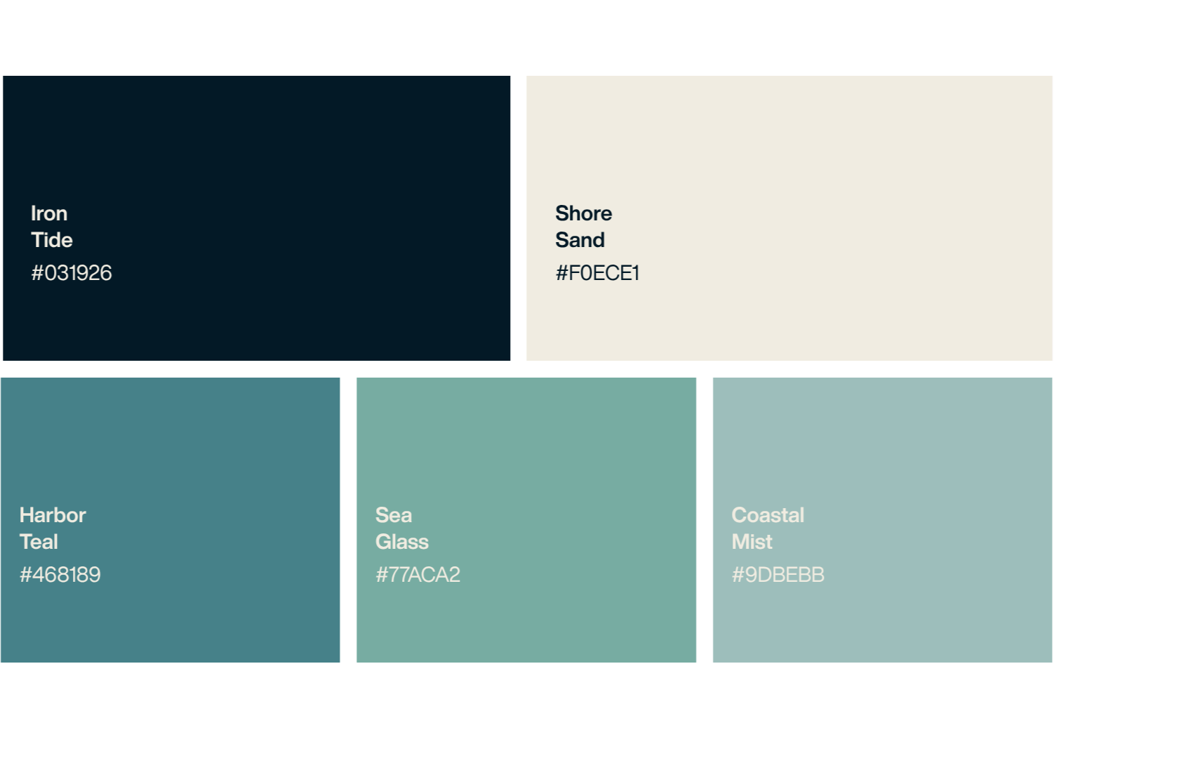
Full color palette
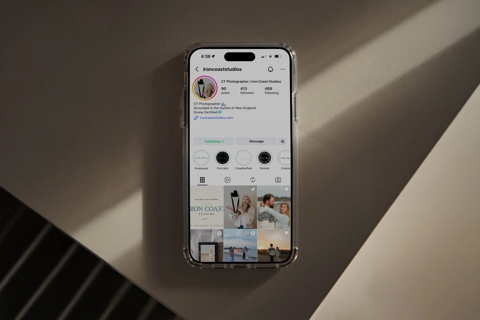
Website design and development
Skills Applied:
Brand Identity Design
Logo Design
Web Design
Web Development (Squarespace)
UX/UI Design
THE TRANSFORMATION
The old identity didn't fully reflect where things were heading. This one does.
The rename from Ferri Photos to Iron Coast Studios wasn't cosmetic — it was strategic.
Ferri (Italian) → iron. Pair that with a love for the coast, and it all comes together.
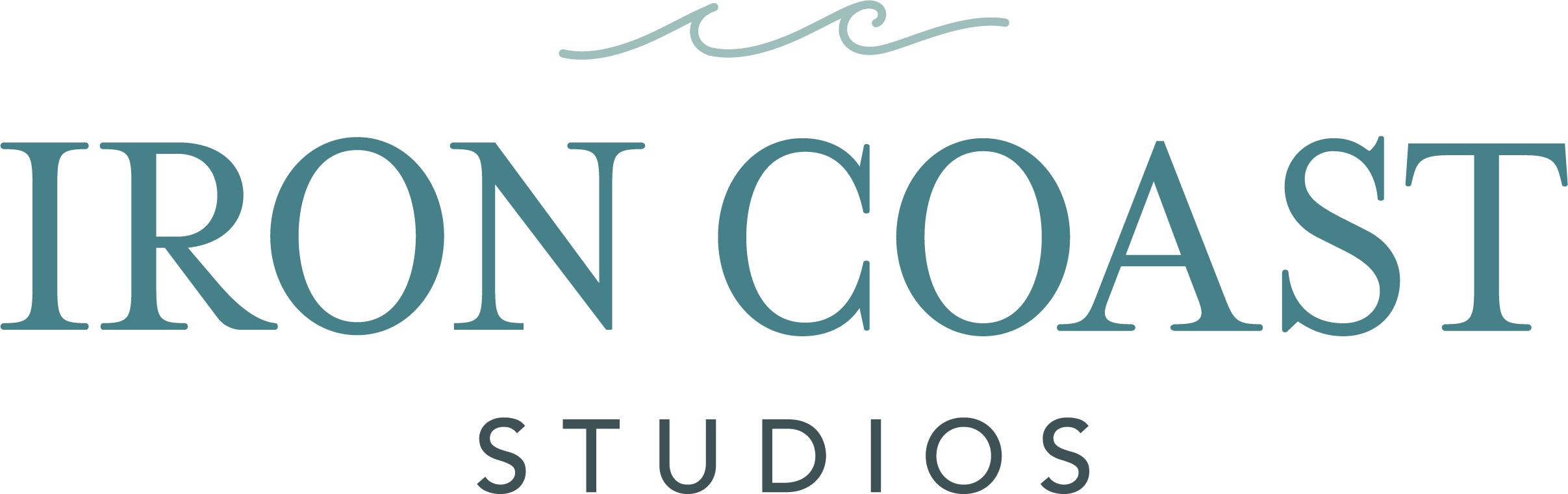
Primary Logo
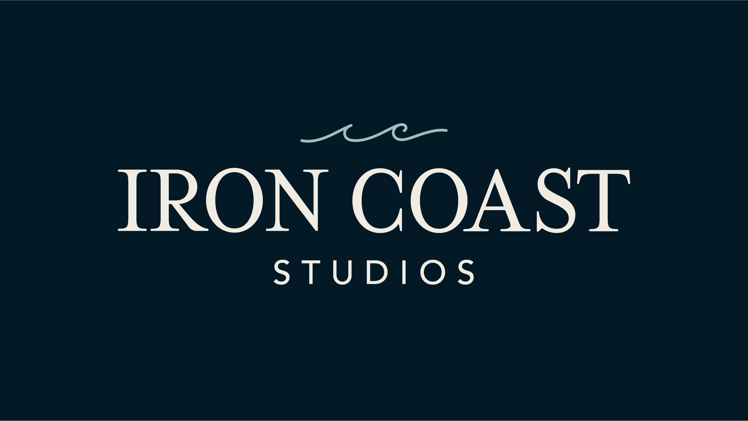
Secondary Logo
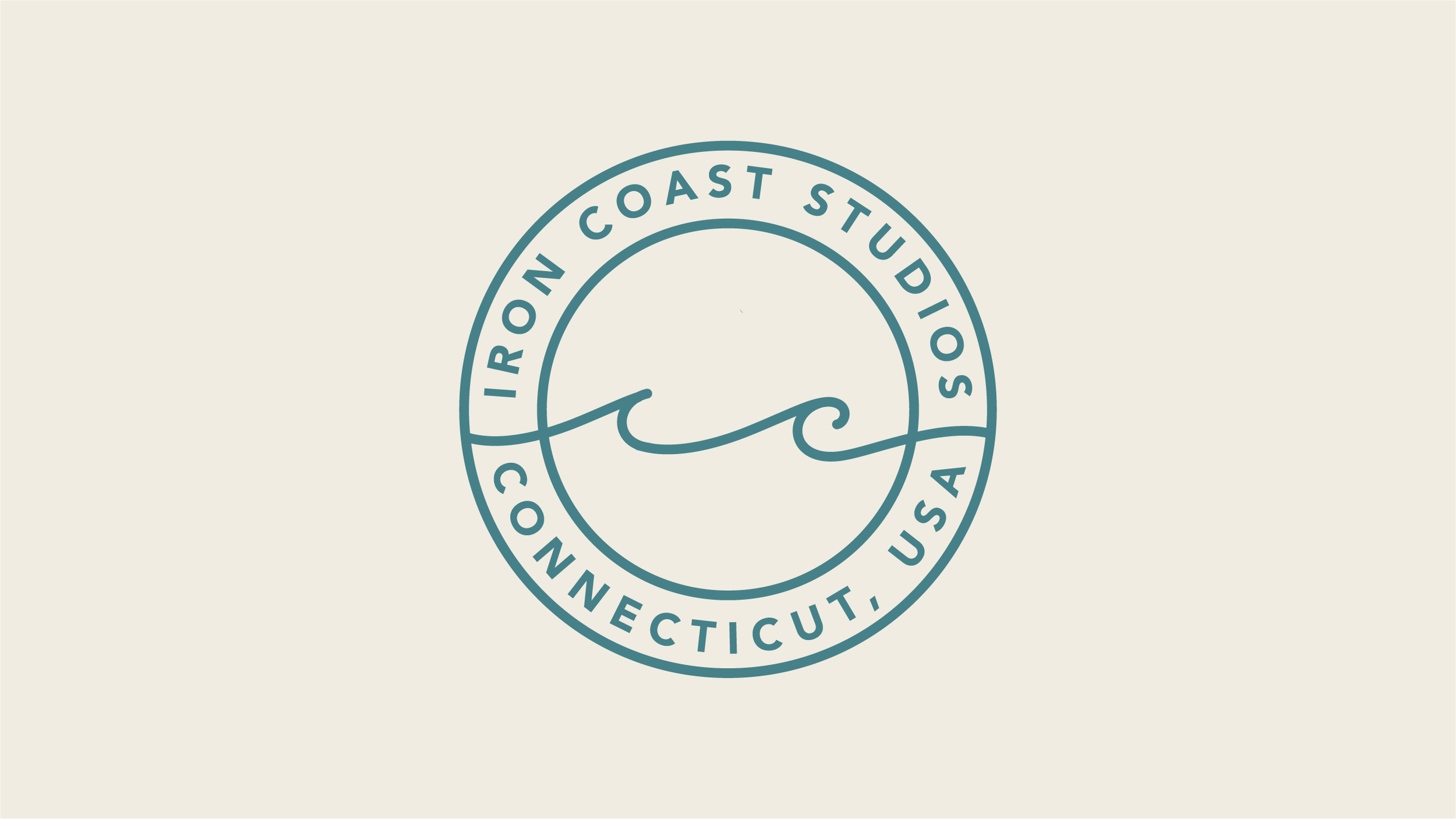
Icon
Great work comes from presence, not process. The visual identity reflects that — every element chosen for how it feels, not just how it looks.
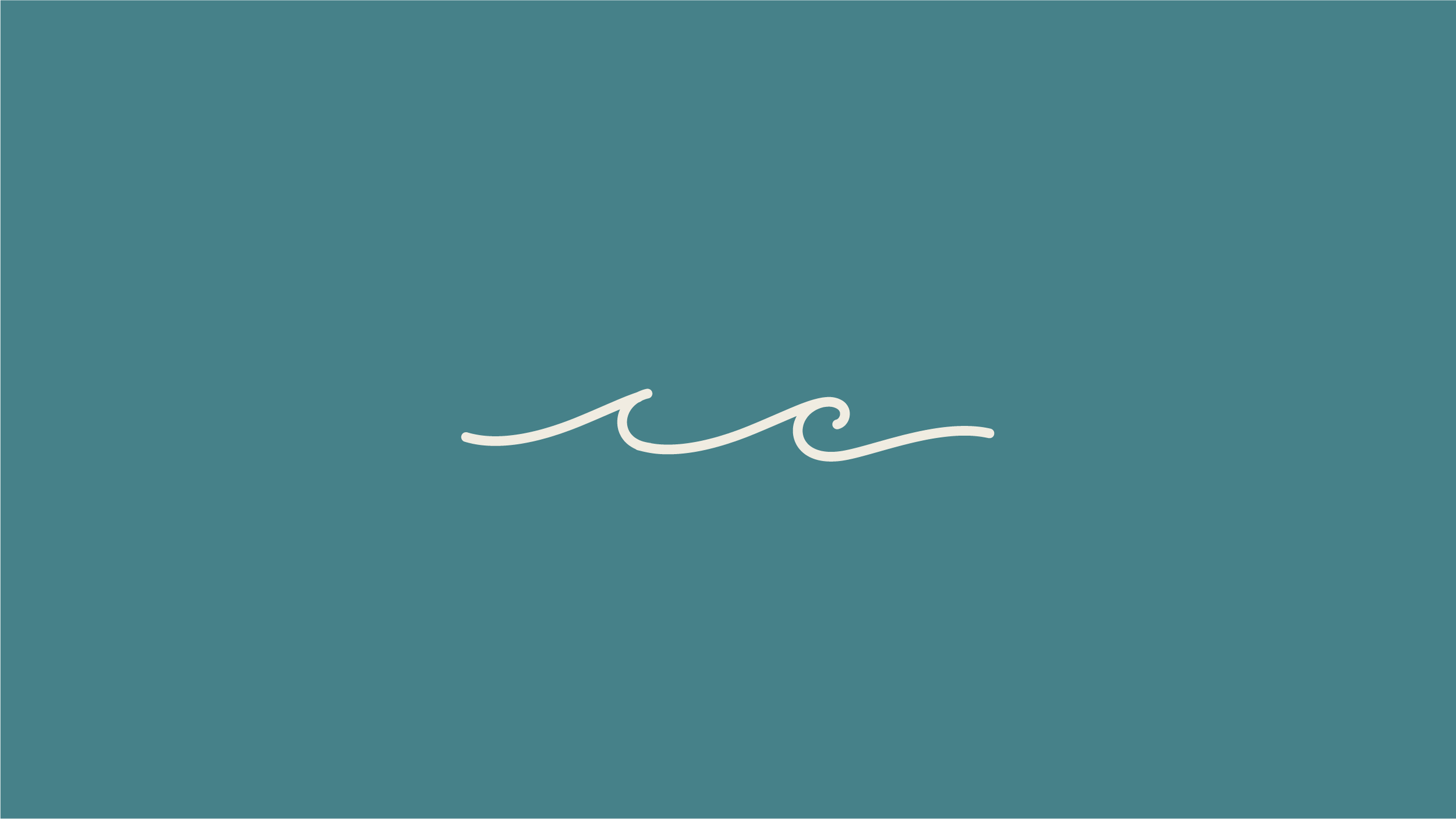
The logo pairs a refined serif wordmark with a custom wave symbol that subtly forms the initials I and C — balancing fluid creativity with grounded strength.
Brand Identity
TARGET AUDIENCE
Two distinct clients, one cohesive brand
The Sentimentalist
Ages 25–40
They want someone who reads the room and hands them back something that makes them feel the moment all over again.
The new identity and website needed to speak to both audiences without feeling generic to either.
The Entrepreneur
Ages 25–40
Small business owners and creatives who need content that looks and feels like them — not a template.
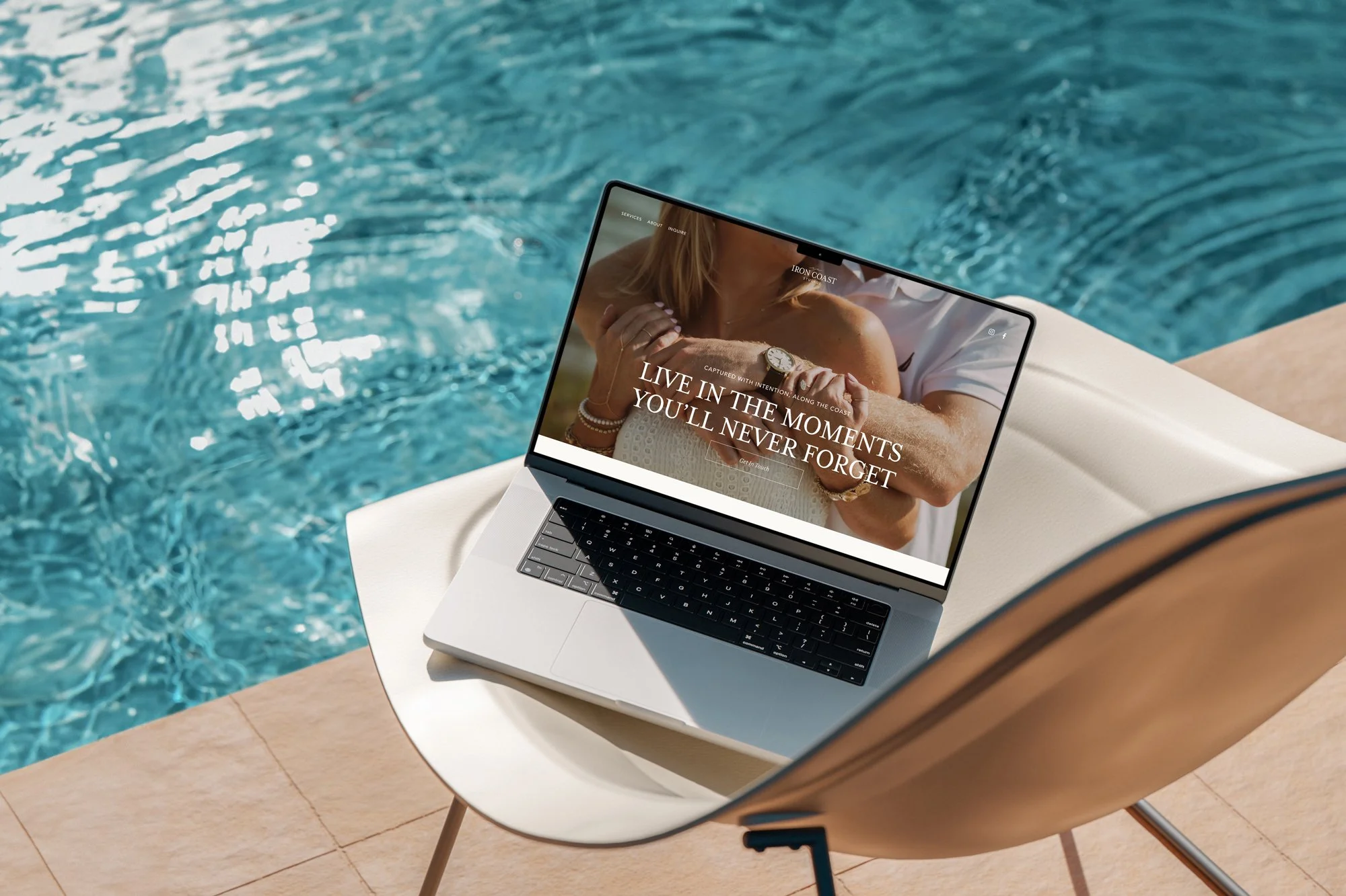
THE RESULT
A site that looks and feels like the work
The new website doesn't just list services — it creates an experience. Deep Iron Tide backgrounds, editorial Mrs Eaves typography, and a portfolio layout that lets the photography breathe. Every decision made to reflect her aesthetic — and convert the right clients. The brand now matches the studio it represents: cinematic, grounded, a little coastal, a little New England.

FROM THE CLIENT