

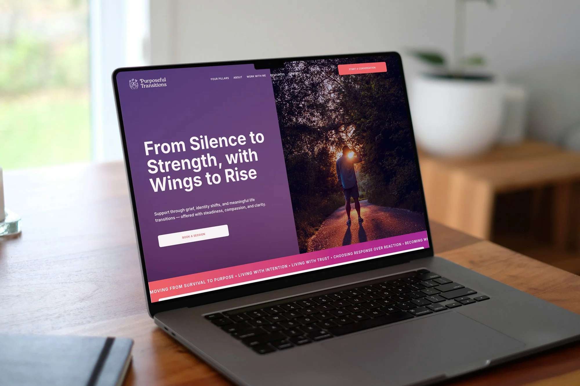
Creating a Compassionate Brand Identity and Website for a Life Transition Support Practice
Purposeful Transitions needed a brand and website that matched the depth of the work being done. The existing identity wasn't communicating the warmth, trust, and intention behind the practice. The goal was to create a cohesive brand and digital presence that feels grounding, human, and aligned with the people it's meant to serve.
About the Client
Purposeful Transitions came to Studio Pierson with a name, a mission, and nothing else. No brand, no website, no online presence. The work was real from the start. It just needed a visual identity and a digital home to match.
The Challenge
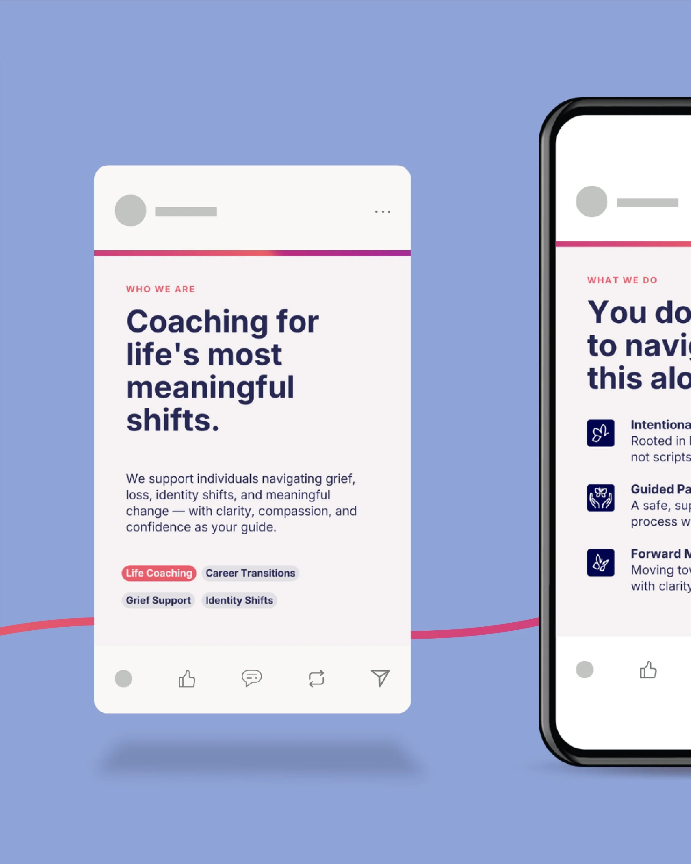
Building from scratch meant every decision carried weight. There was no existing brand to pull from, just a vision and a lot of heart. The brand needed to feel trustworthy, warm, and human. Something that could meet people right where they are. From there, we built out social media templates and handled the planning and coordination to give the brand a consistent, cohesive presence from day one.
Client
Purposeful Transitions
My Role:
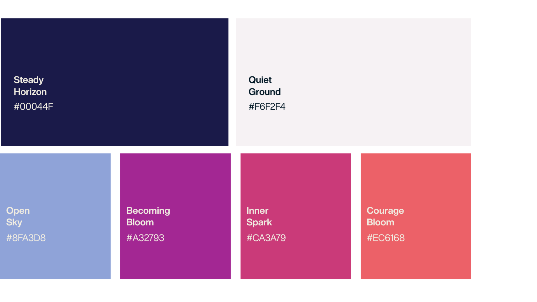
I led the full brand and website development for Purposeful Transitions — defining a visual identity rooted in warmth, trust, and intentional growth, and building a cohesive system across logo, color, and typography. The website was designed to feel welcoming yet grounded, allowing the mission to lead while creating a clear, gentle path to inquiry.
Deliverables:
Primary logo
Secondary logo variation
Brand icon
Full color palette
Website design and development
Social media templates
Social media planning + coordination
Skills Applied:
Brand Identity Design
Logo Design
Web Design
Web Development (Wix)
UX/UI Design
Social Media Design
Social Media Strategy
THE BUILD
No starting point except a vision.
We built from there.
This was a full build. Brand, website, and social presence created from scratch for a practice that supports people through some of the hardest moments of their lives. Grief, identity shifts, career changes, major life pivots. The people coming to Purposeful Transitions needed to feel held before they ever reached out. That shaped every design decision we made.

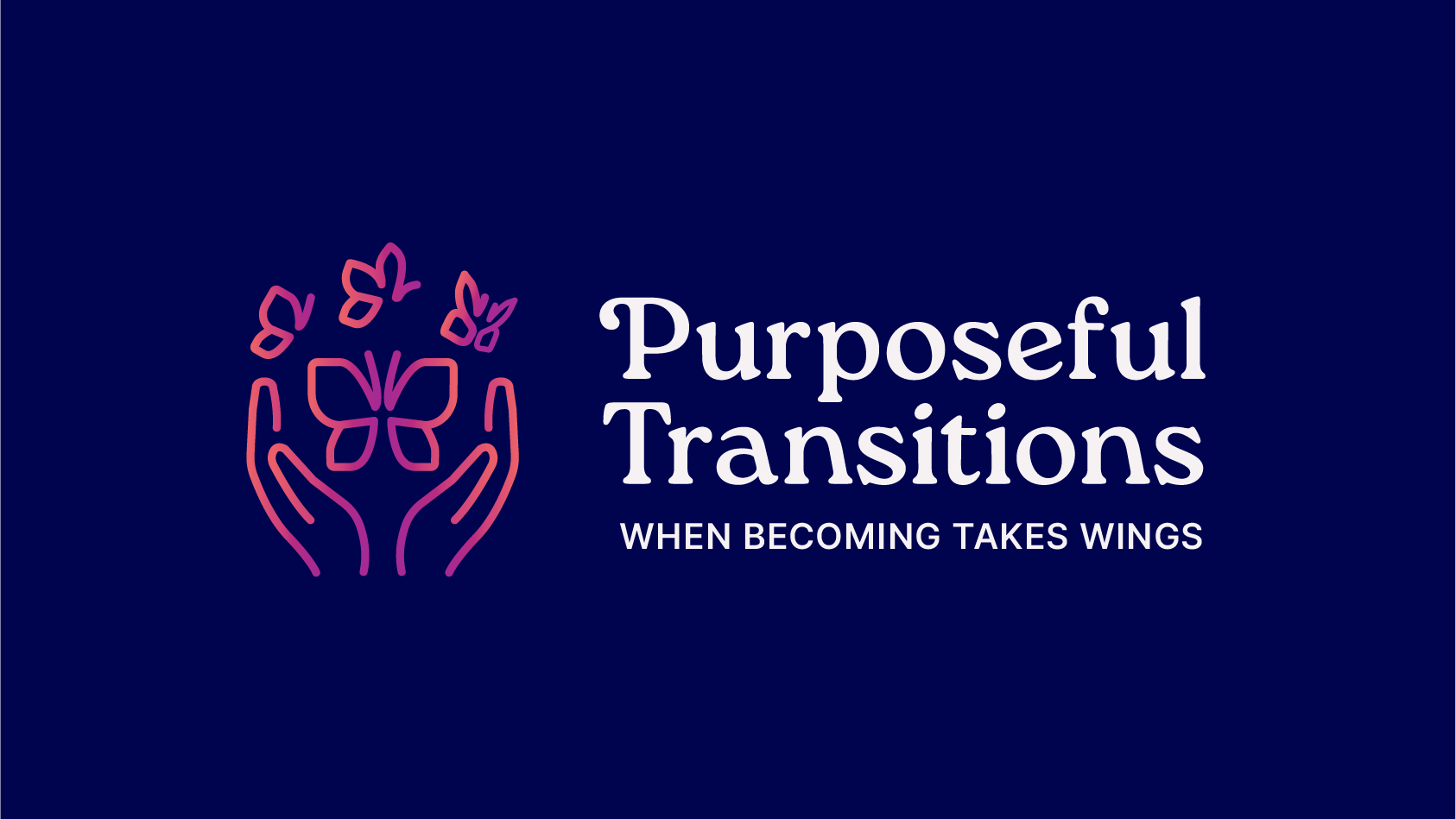
Primary Logo - Full Color
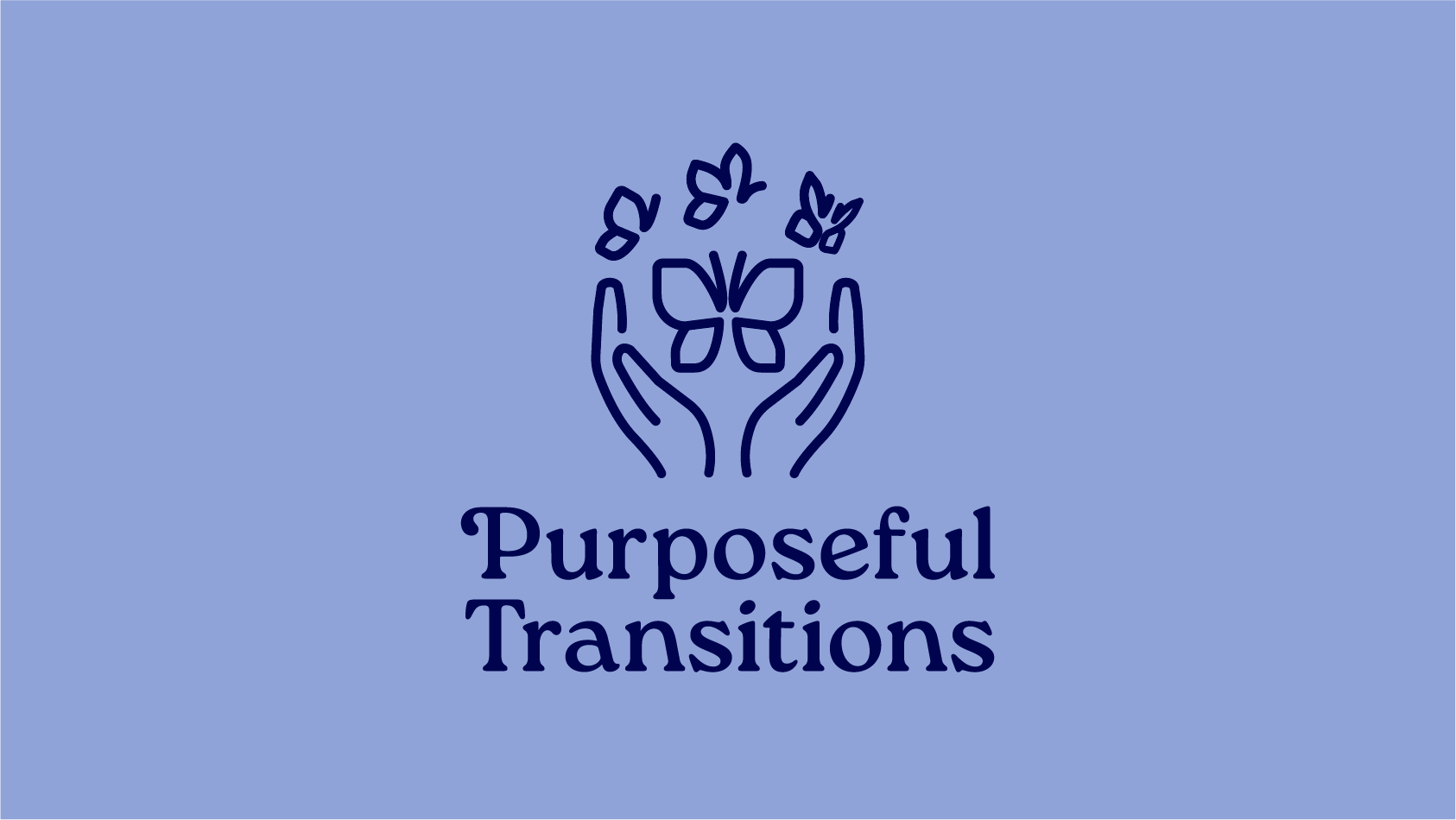
Secondary Logo - One Color
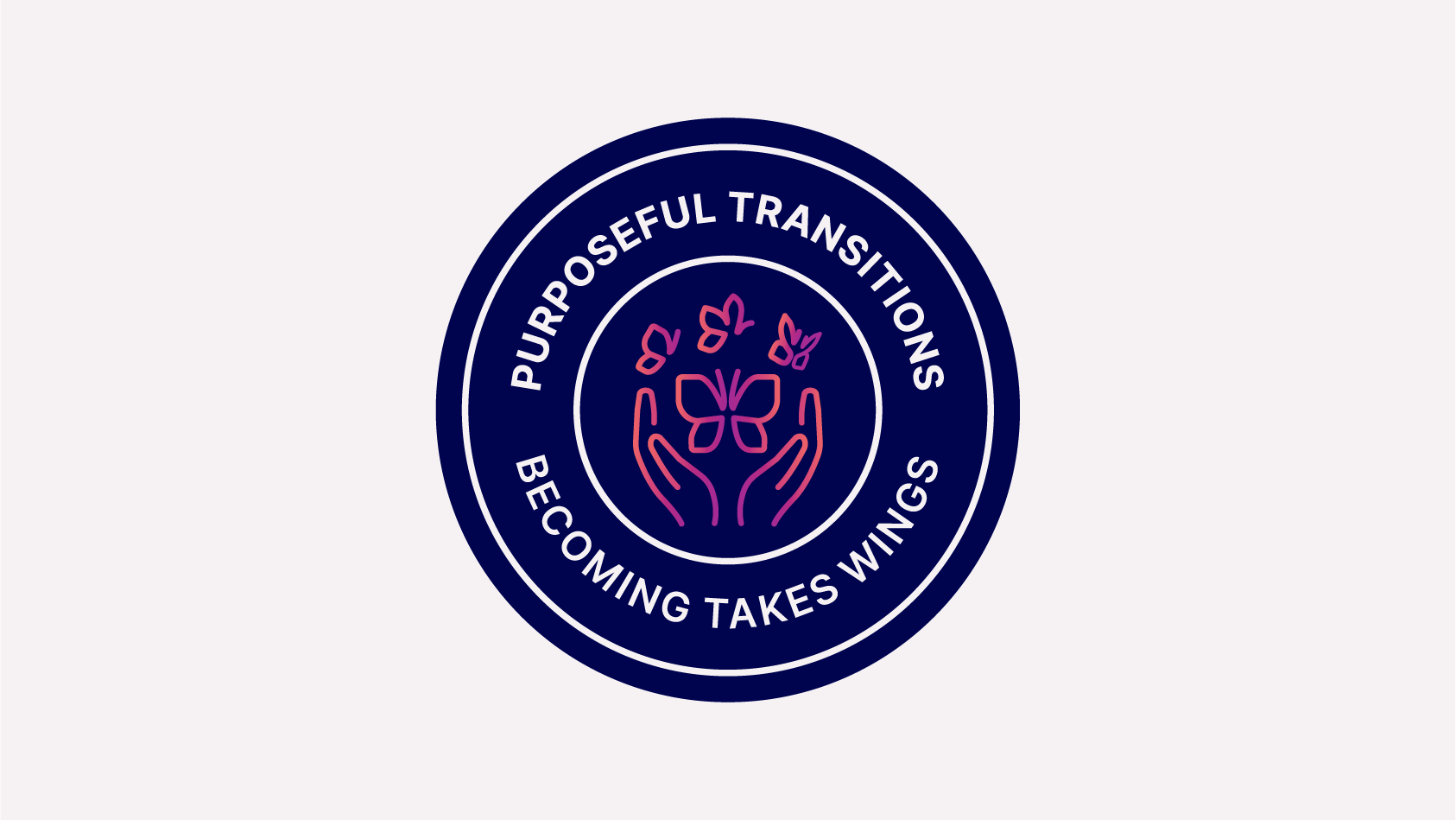
Badge - Full Color
The finished brand and website give Purposeful Transitions a real, grounded presence. Warm without being soft. Trustworthy without being stiff. The social templates make it easy to show up consistently, and the planning behind it means the content actually connects. From day one, the brand looked and felt like it had always been there.
Brand Identity
TARGET AUDIENCE
Different seasons of change. One brand that speaks to all of them.
The Griever
Someone navigating loss, whether that is a person, a relationship, or a version of themselves they have outgrown. They need to feel seen and supported before they are ready to take any next step.
The Career Pivoter
Someone stepping away from what was and figuring out what comes next. They want clarity and a thought partner who takes their transition seriously and helps them move forward with intention.
The Life Seeker
Someone in the middle of a shift they cannot quite name yet. They know something needs to change and they are ready to do the work with someone who can help them find their footing.
THE RESULT
A brand that feels like a first exhale.
The website gives potential clients a clear path from curiosity to inquiry. The social presence keeps Purposeful Transitions visible and consistent between sessions. And the brand as a whole does what it needs to do most: it makes people feel like they are in the right place.