Creating a Luxury Brand Identity and Website for a Hudson Valley Wedding Planner
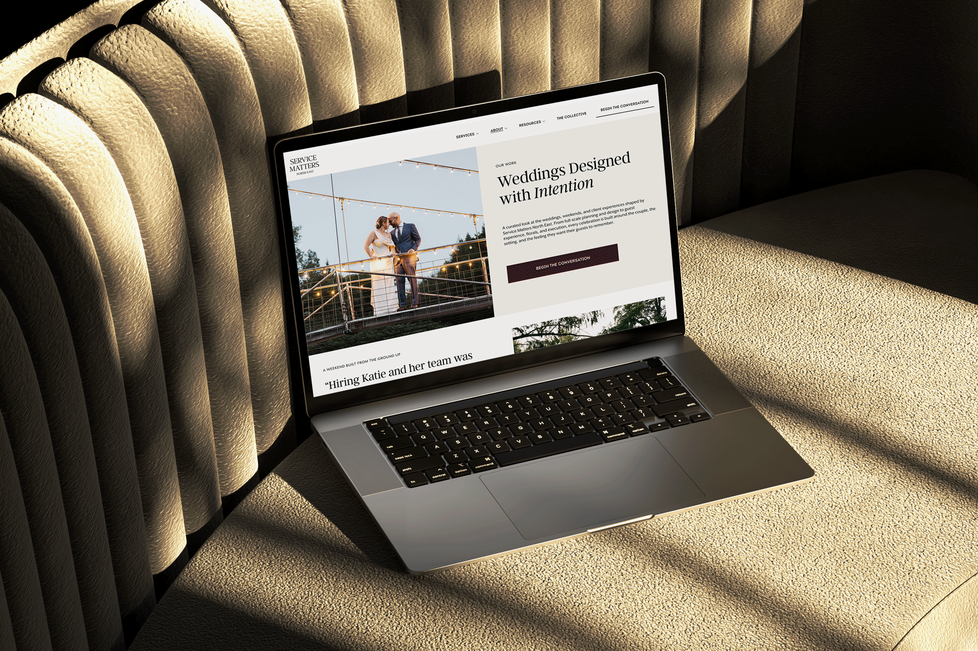
Service Matters North East had 16 years of five-star weddings behind it, but the brand and website no longer reflected the level of service Katie Parent delivers. The goal was to reposition an established planning business into a luxury brand that feels as elevated as the weekends they design, and to build a digital presence that is refined, considered, and unmistakably theirs.
About the Client
Service Matters North East is led by Katie Parent, a wedding planner and designer who has spent 16 years creating full-weekend celebrations across the Hudson Valley, Catskills, and Connecticut. What began with a single wedding grew into a company built on deep relationships, regional knowledge, and full-weekend presence, with in-house floral design through Josie's Blooms. The reputation and the reviews were already there. The brand needed to catch up.
The Challenge
Katie's work sits firmly in the luxury, non-traditional space: tented weekends on private estates, mountain retreats, and multi-day guest experiences. But the previous brand and site read like a general event planner, not the high-touch designer couples were actually hiring. Service Matters North East needed an identity that communicated something more: an experienced, relationship-first partner creating elevated celebrations, ready to stand alongside the region's most established luxury planners.
Client
Service Matters North East
My Role:
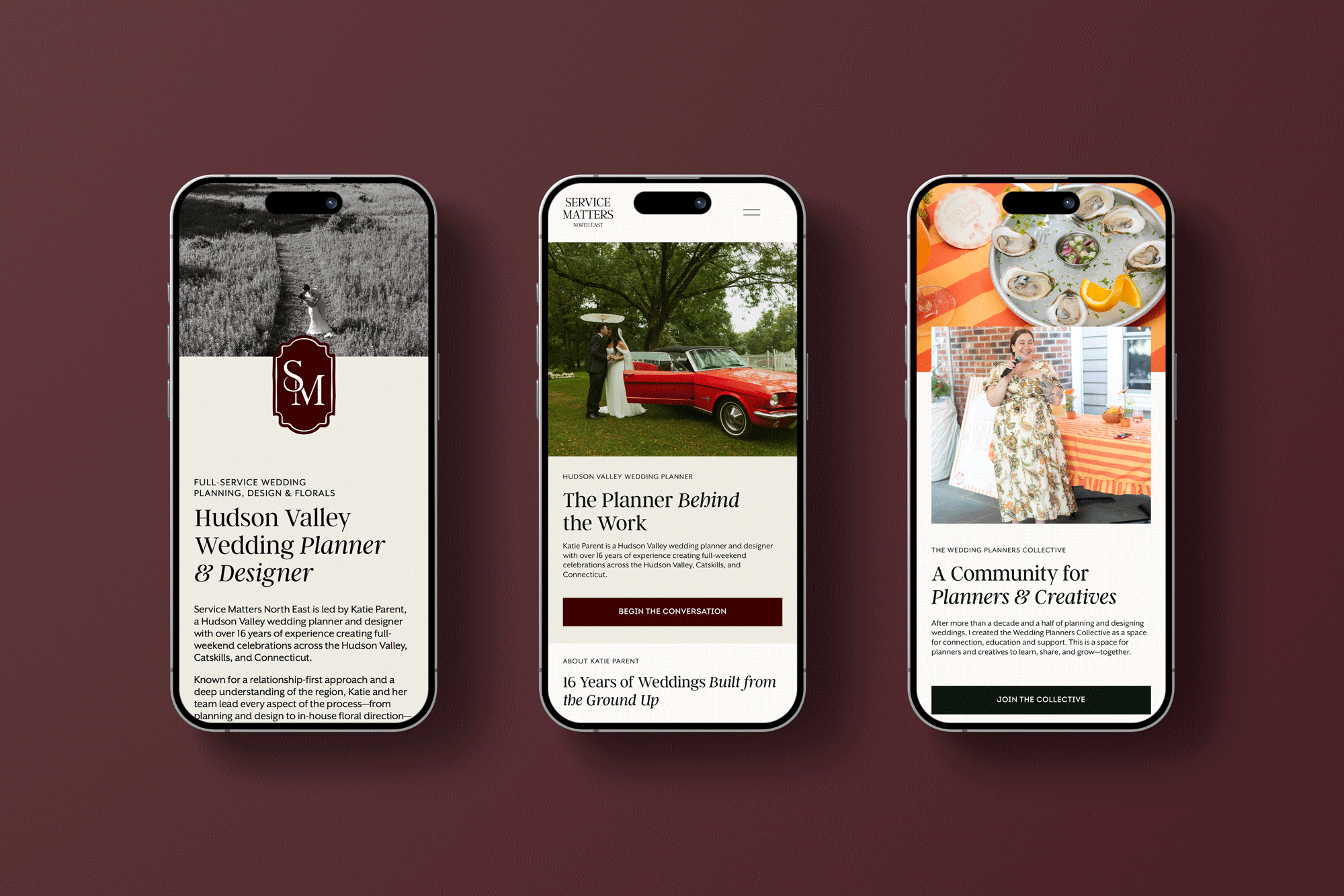
I led the full brand and website development for Service Matters North East, defining a luxury visual identity rooted in warmth, refinement, and a strong sense of hospitality, and building a cohesive system across logo, color, and typography. The website was designed to feel elevated yet personal, allowing the work to lead while creating a clear, intentional path to inquiry.
Deliverables:
Primary logo
Secondary logo variation
Brand icon
Full color palette
Website design and development
Skills Applied:
Brand Identity Design
Logo Design
Web Design
Web Development (Squarespace)
UX/UI Design
THE BRAND
The reputation was already luxury. The brand needed to catch up.
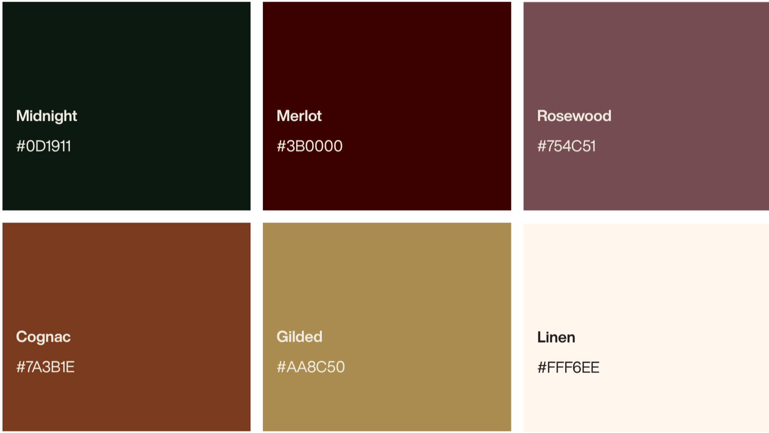
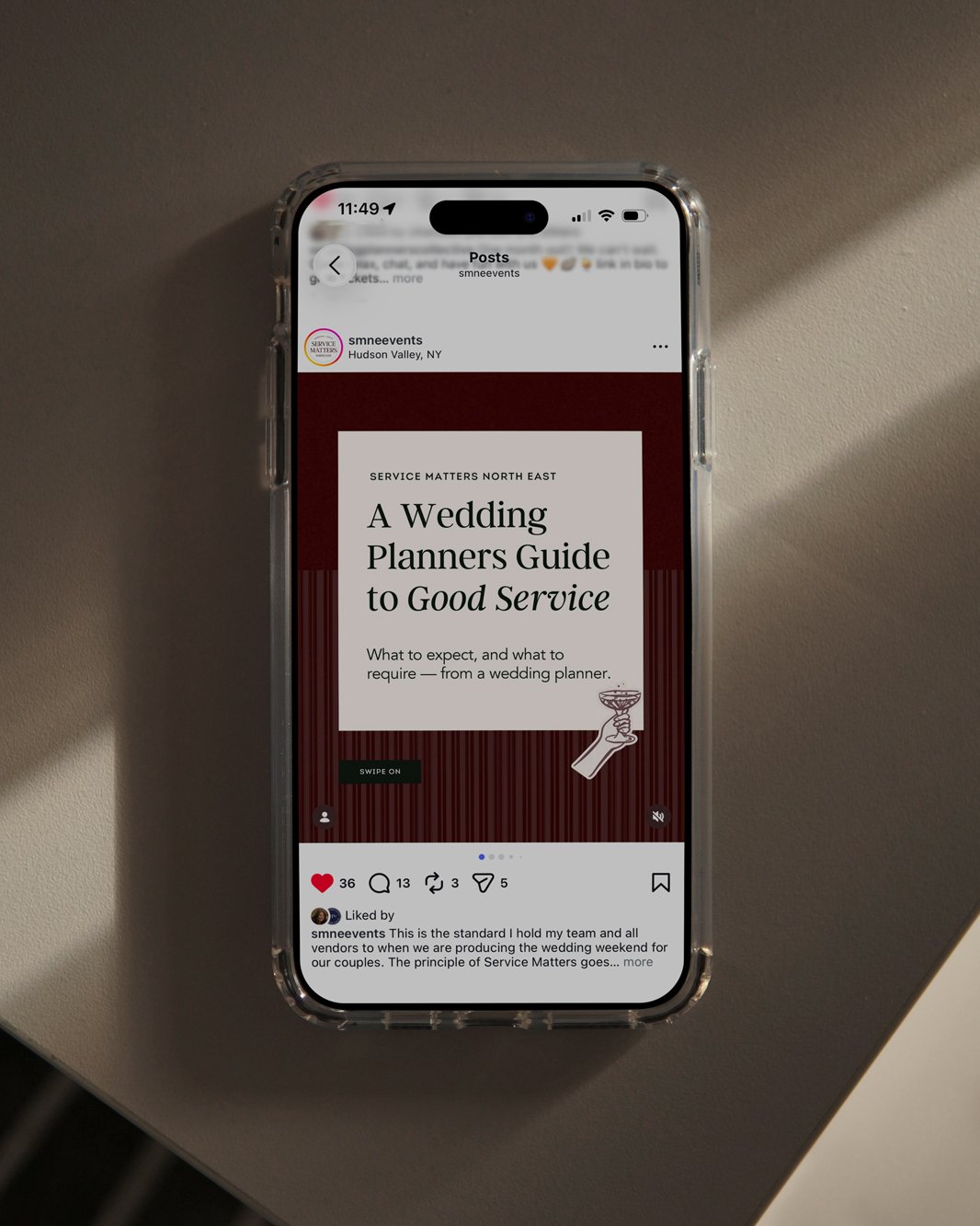
This was a repositioning, not a cosmetic refresh. Every element of the identity was chosen to reflect the feeling of working with Katie: calm, personal, and deeply considered. Refined typography, an elegant monogram, and a warm, confident palette now communicate the experience couples can expect before their first call.

Primary Logo
Badge
Monogram
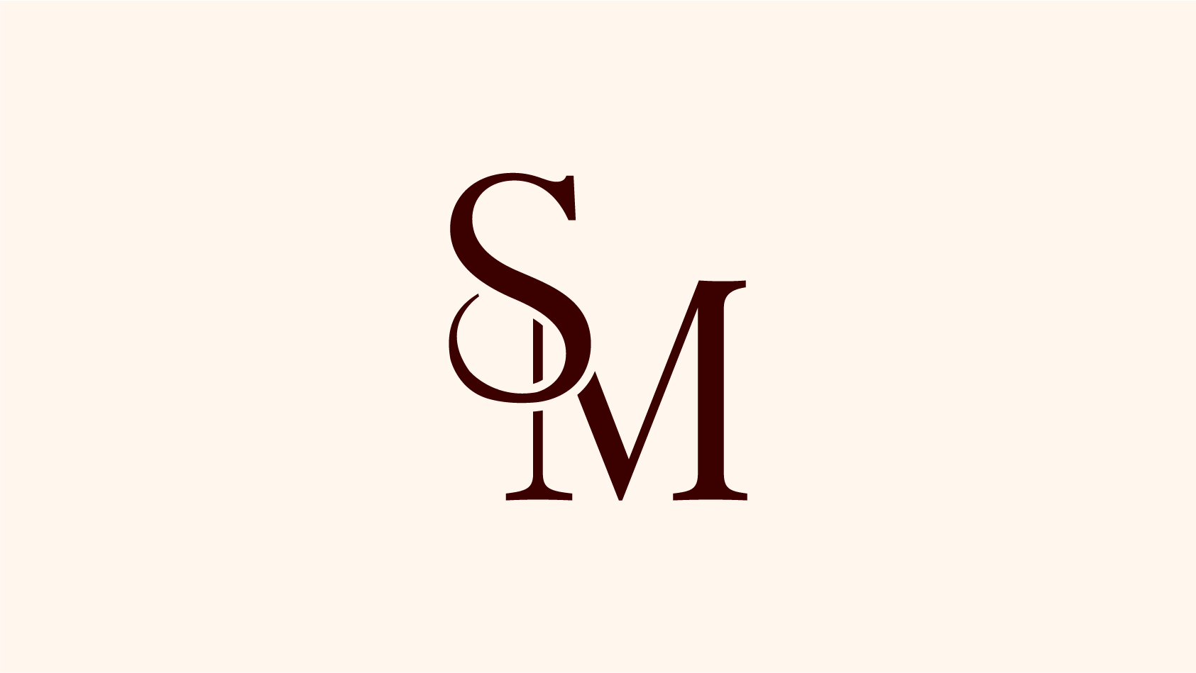
The identity balances timeless elegance with genuine warmth. A refined serif wordmark pairs with an ornate monogram that carries across print, signage, and social, giving the brand a mark that feels established and heirloom, not trend-driven.
Brand Identity
TARGET AUDIENCE
Two distinct couples, one cohesive brand
The Full-Weekend Couple
Planning a multi-day celebration on a private estate or in the mountains, they want a single expert leading design, logistics, and florals from first vision to final send-off.
The new identity and website needed to speak to both without losing the luxury feel for either.
The Partial-Planning Couple
They have built a foundation and real momentum on their own, and want a senior, trusted hand to close the gaps and lead the final stretch.
THE RESULT
A brand and site that feel like the experience
The new website does more than list packages. Large photography, editorial typography, generous space, and a clear booking journey reflect the Service Matters experience before a single consultation. The brand now matches the weddings it produces: intentional, elevated, and entirely personal.