

What a little time away did to my eye, and the palette I came home with.
It got a little quiet around the studio this summer, and here's why. In August I stepped away to be home with my family, and for once I actually unplugged. No client files. No quick inbox checks. No half-working through it.
What surprised me was how fast my eye woke back up once I wasn't staring at a screen all day. Color was everywhere, in the most ordinary moments, and I started noticing it the way I did before design was my job. I pulled a palette from three of those moments. Here's what came home with me.
A bouquet from the flower farm
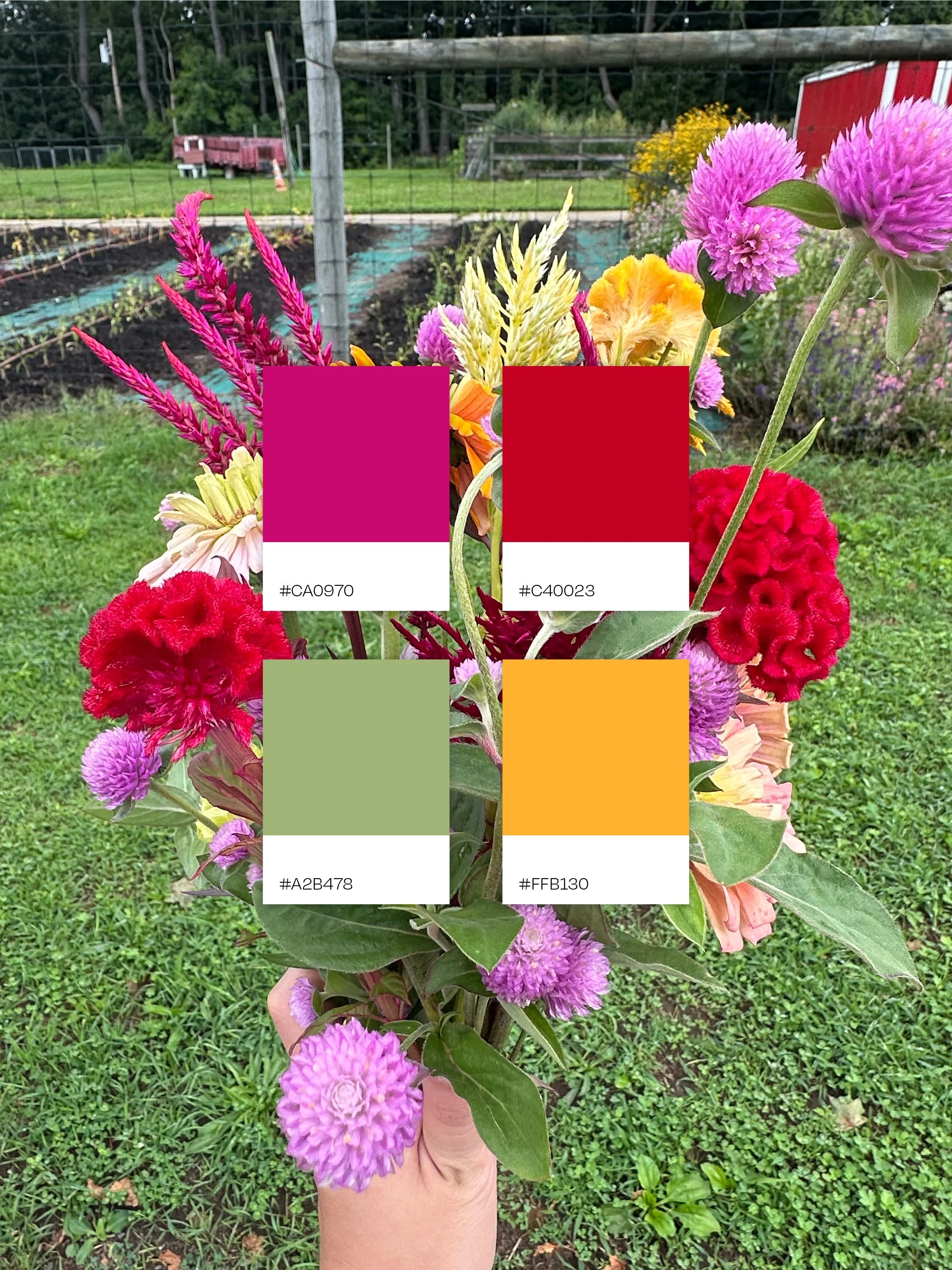
We spent a morning cutting flowers at a pick-your-own farm, and the bouquet that made it home was loud in the best way. Nobody planned it to coordinate. Hot pink sat next to deep red, sat next to gold, and it worked anyway. The lesson: contrast you'd second-guess on a mood board often looks completely natural in real life.
Chalk on the driveway
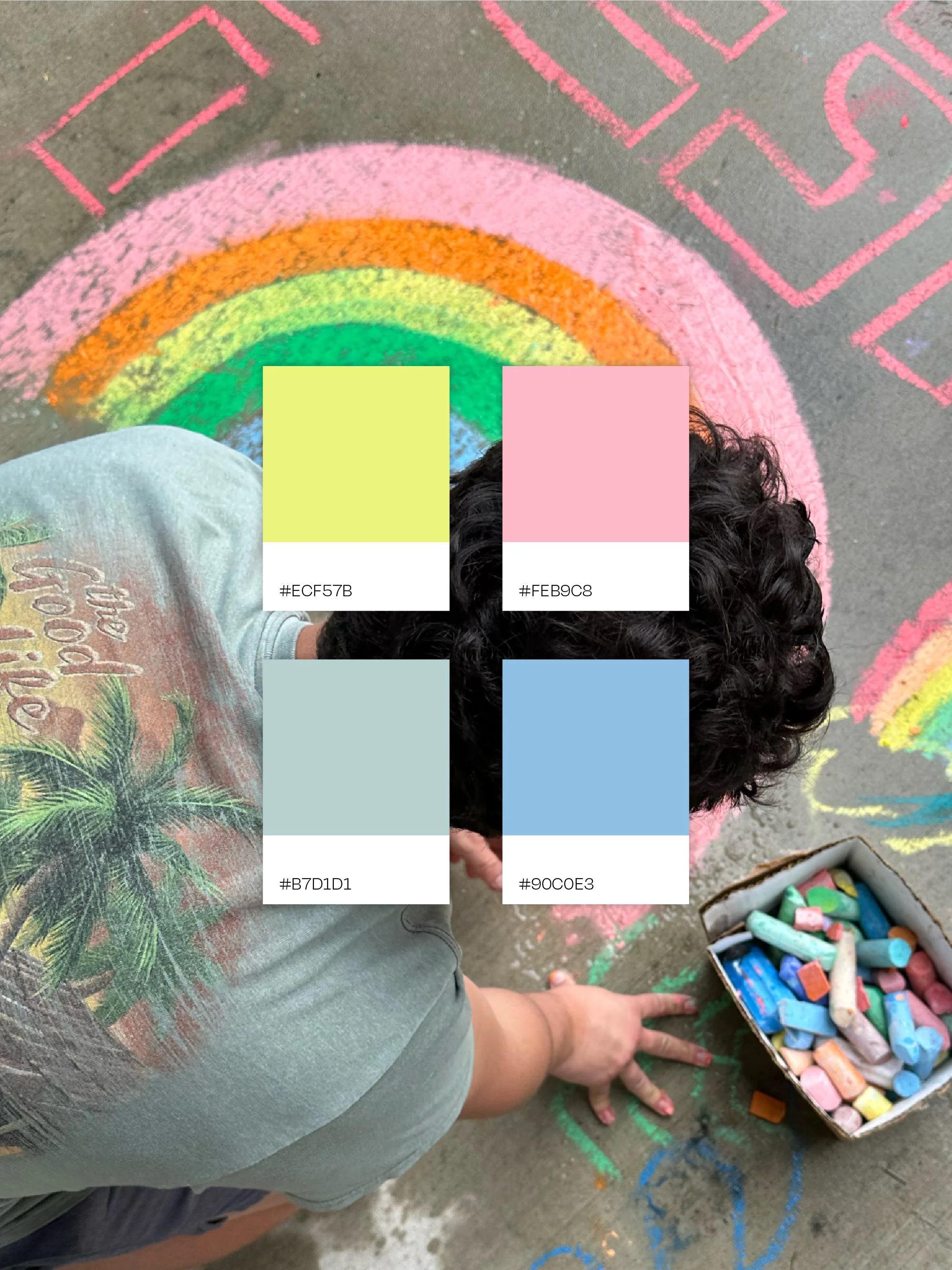
Sidewalk chalk follows zero brand guidelines. Pinks layered over blues layered over oranges. It was messy and happy, and I couldn't stop looking at it. The lesson: soft colors don't have to feel delicate. Put pastels together with a little energy, and they read as pure joy.
Apples in late summer light
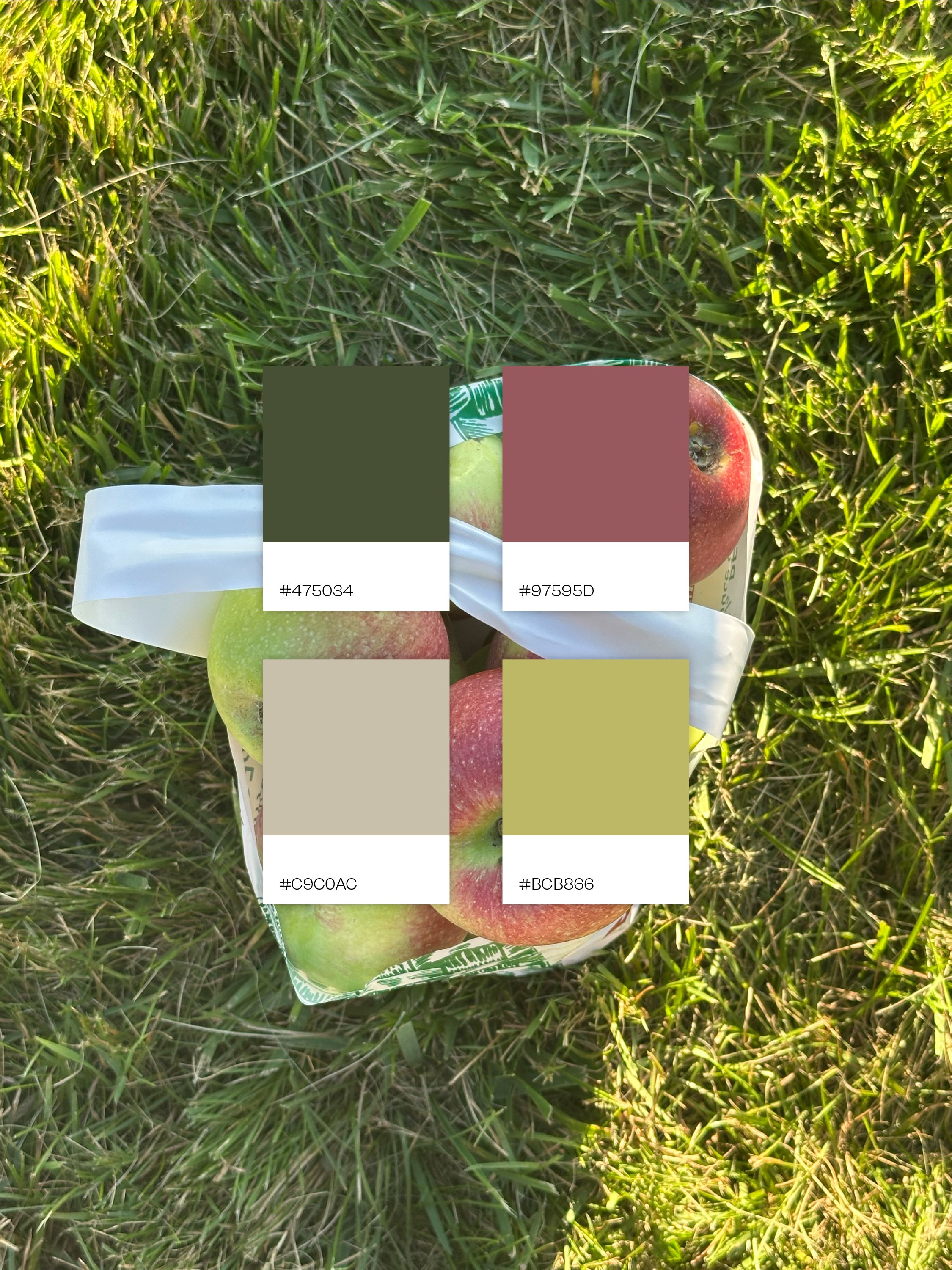
Apple picking at the orchard, right as the light turned golden. A bag of apples isn't flashy on its own, but in that light every tone went warm: the earthy wood, the green-gold fruit, the soft yellow glow over all of it. The lesson: earthy colors get their warmth from what surrounds them. Context changes everything, in a photo and in a brand.
What changed when I came back
Stepping out of studio brain for a bit reset how I see color. I came back reaching for warmer, braver, more human palettes, and I'm carrying that into every project on my desk.
It also reminded me where the best brand colors come from. Not a trending palette, but the real places, products, and moments that make a business what it is.
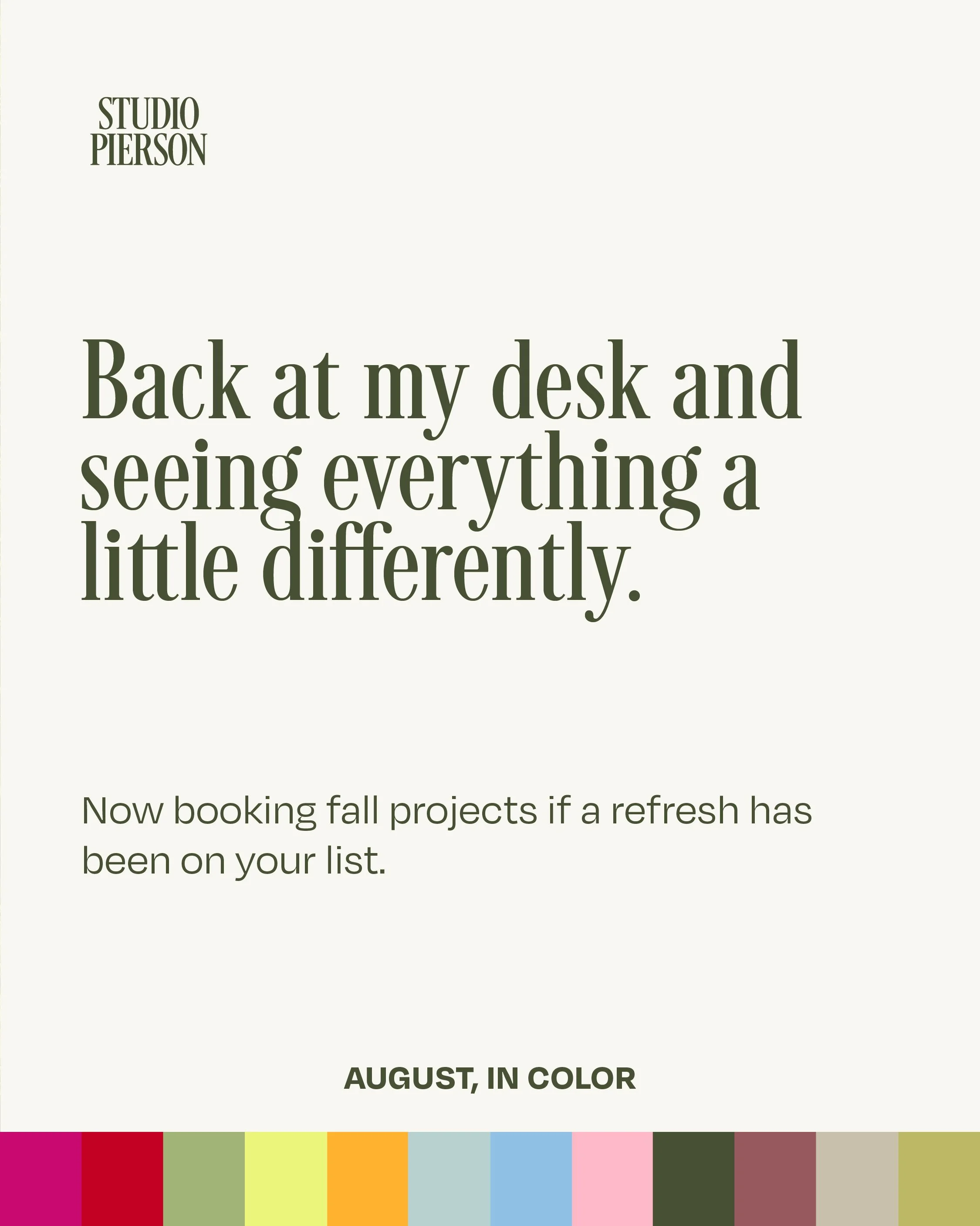
Try it with your own photos
Pick three photos that feel like your business: your space, your product, your people.
Pull three colors from each. Canva's color palette tool will do it from an uploaded image, or just eyedrop the ones that jump out.
Lay all nine side by side and notice what repeats. That's usually the start of something.
Back at my desk
I'm back, and seeing everything a little differently. I'm taking on a few new brand and web projects this fall and into the new year.
If a refresh has been sitting on your list, let's talk.