

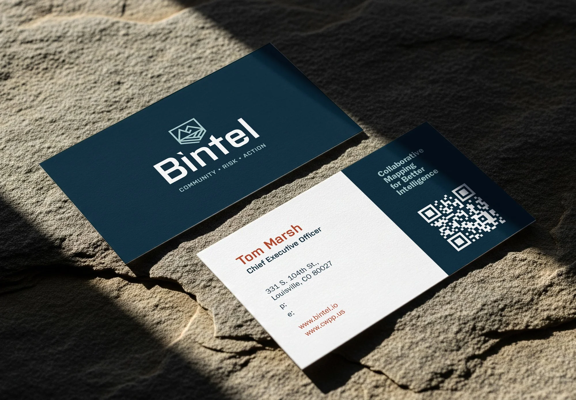
A brand can look polished and still leave people unsure what you do, who you help, or why they should choose you. That’s usually not a sign you need to start over. It’s a sign to look at how the pieces are working together.
Branding is more than a logo. It’s the experience people have as they find you, learn about your services, and decide whether to reach out. Here are eight common small business branding mistakes, plus practical ways to fix them.
1. Starting with colors and a logo before getting clear on your business
It’s tempting to begin with the fun part: choosing a typeface, collecting inspiration, and sketching logo ideas. But visuals can’t do the job of a clear business strategy.
If you haven’t decided who you’re trying to reach, what you offer, and what makes your approach distinct, even a beautiful identity may feel generic. Research on small and medium-sized businesses has also linked brand vision and positioning with brand performance. In other words, clarity matters before the color palette.
How to fix it: Write a short brand brief before making visual decisions. Include:
- Who you most want to work with
- The problem they need help solving
- What makes your approach different
- What evidence supports your claims
- What you want people to do next
Let those answers guide your design and messaging. The goal isn’t to make every choice sound clever. It’s to make sure the choices feel connected.
2. Trying to appeal to everyone
When you’re building a business, turning away potential customers can feel risky. So you may try to keep your language broad: “We provide quality services for everyone.” The trouble is, that doesn’t give any one person a reason to think, “This is for me.”
A more focused message can help the right customers recognize themselves. The U.S. Small Business Administration also recommends narrowing your target market and focusing on qualified leads.
How to fix it: Look at your recent customers. Which ones were the best fit for your services? What did they need, and what made them choose you? Speak with a few of them and listen for the words they use to describe their challenges and goals. You can serve more than one type of customer, but make your main message specific enough to be memorable.
3. Using the same claims as your competitors
“Quality,” “professional,” and “trusted” can be true, but they’re hard to own. If every business in your category uses the same words, customers have little to go on when they compare you.
Differentiation doesn’t have to mean being louder or more unusual. It can come from the way you work, the people you serve, your expertise, or the experience you create.
How to fix it: Review a handful of competitors and note what they emphasize. Then ask what you can credibly say that they can’t. Be specific, and back it up with a process, example, credential, or customer feedback.
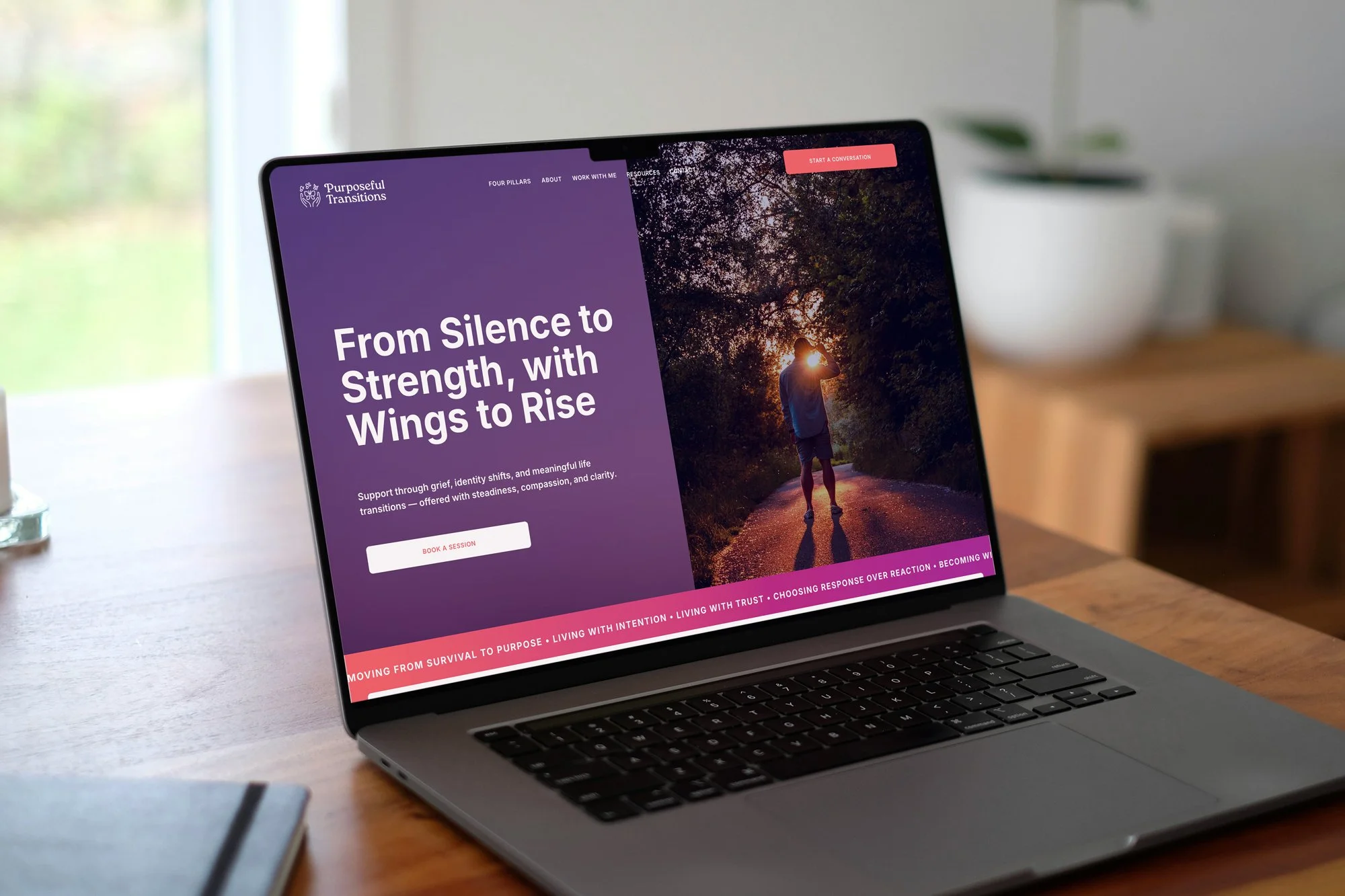
For instance, Purposeful Transitions needed a brand that felt warm and trustworthy for people navigating major life changes. The identity and website were built around that particular audience and the feeling they needed from their first interaction. That kind of clarity gives design a meaningful place to start.
4. Treating your logo as your whole brand
A logo is an important part of your identity, but it’s only one part. Your photography, color palette, typography, writing, website, and customer experience all help people understand what your business is like.
Relying on a single logo file can also make everyday use harder. A mark that looks good on a website header may not work as a tiny social profile image or on a dark background.
How to fix it: Build a simple, flexible identity system. Make sure you have logo variations that work at different sizes and in different settings. Choose a small group of typefaces and colors, and set basic guidance for photos and tone of voice.
You don’t need a 90-page brand manual to get started. A clear set of files and a few practical rules can make your brand easier to use consistently.
5. Letting your brand change from platform to platform
Your Instagram profile says one thing. Your website says another. Your invoice uses an old logo, and your email signature has a third version of your business description. These little differences can make a business feel less considered than it really is.
How to fix it: Make a list of your most visible customer touchpoints, such as your website, social profiles, email signature, proposals, and printed materials. Check that they use the same business name, service descriptions, visual style, and contact details.
Then create reusable templates for the materials you update often. If multiple people create content, give them access to the right files and straightforward brand guidance. Consistency is easier when the tools are easy to find.
6. Writing about yourself instead of the customer
Your experience, values, and process matter. But people visiting your website usually arrive with their own questions: Can you help with my problem? What will working with you be like? What should I do next?
If you bury the answers under broad claims or industry jargon, visitors may leave before they understand your value.
How to fix it: Check that your homepage and service pages quickly answer four questions:
1. What do you offer?
2. Who is it for?
3. What does it help them achieve?
4. How can they take the next step?
Use plain language, specific examples, and customer feedback where it’s helpful. A customer doesn’t need to decode your brand. They need to understand whether you’re a good fit.
7. Making your website look good but hard to use
A thoughtful website should do more than look like your business. It should help visitors find information, understand your offer, and get in touch without unnecessary effort. Unclear navigation, hard-to-read text, and a contact button that’s difficult to find can get in the way.
This matters especially on mobile, where visitors need readable text and pages that fit their screens. Google’s guidance on mobile-friendly pages covers these basics.
How to fix it: Ask a few people who don’t know your website to find a service, locate your contact details, and complete an inquiry form using their phones. Watch where they hesitate. Make those steps clearer.
It’s also worth checking accessibility basics, including color contrast, text alternatives for meaningful images, and forms with clear labels. The W3C’s web accessibility tips offer a helpful starting point.

8. Making promises your customer experience can’t keep
A brand promise creates expectations. If your website promises quick replies but inquiries sit unanswered, or your social content feels personal while the service experience feels impersonal, customers notice the gap.
Your brand is shaped by what you deliver, not only by what you say.
How to fix it: Review the experience from first contact to follow-up. For each important promise, ask who is responsible for delivering it and what a customer should be able to expect. If the promise doesn’t match your current process, adjust the process or the promise.
Keep listening, too. Reviews, customer questions, and the points where people abandon a form can all show you where the experience needs attention.
Start with one small improvement
You don’t need to change everything at once. Choose one place where your brand feels unclear or inconsistent. It could be your homepage headline, an old logo on a social profile, or a service description that doesn’t sound like you.
Make the fix, then look at the next touchpoint. Small, considered improvements can make your business easier to recognize and easier to trust.
If you’d like a thought partner, a small business branding agency can help align your strategy, visual identity, and website more closely. At Studio Pierson, we work with small businesses and creatives to create brands that feel intentional and communicate clearly.
Take a look at our portfolio, learn more about the studio or get in touch when you’re ready.