

Your website is getting visitors, but the inquiries aren’t following. It’s a frustrating gap, and it doesn’t always mean you need more traffic. Sometimes a visitor is interested but can’t quickly understand what you offer, find proof they can trust you, or work out what to do next.
I’d start with a simple check: open your website as if you’ve never seen it before. Can you understand the offer and take the next step without having to hunt? Here are ten common conversion barriers, with a practical fix for each.
1. Your message isn’t clear above the fold
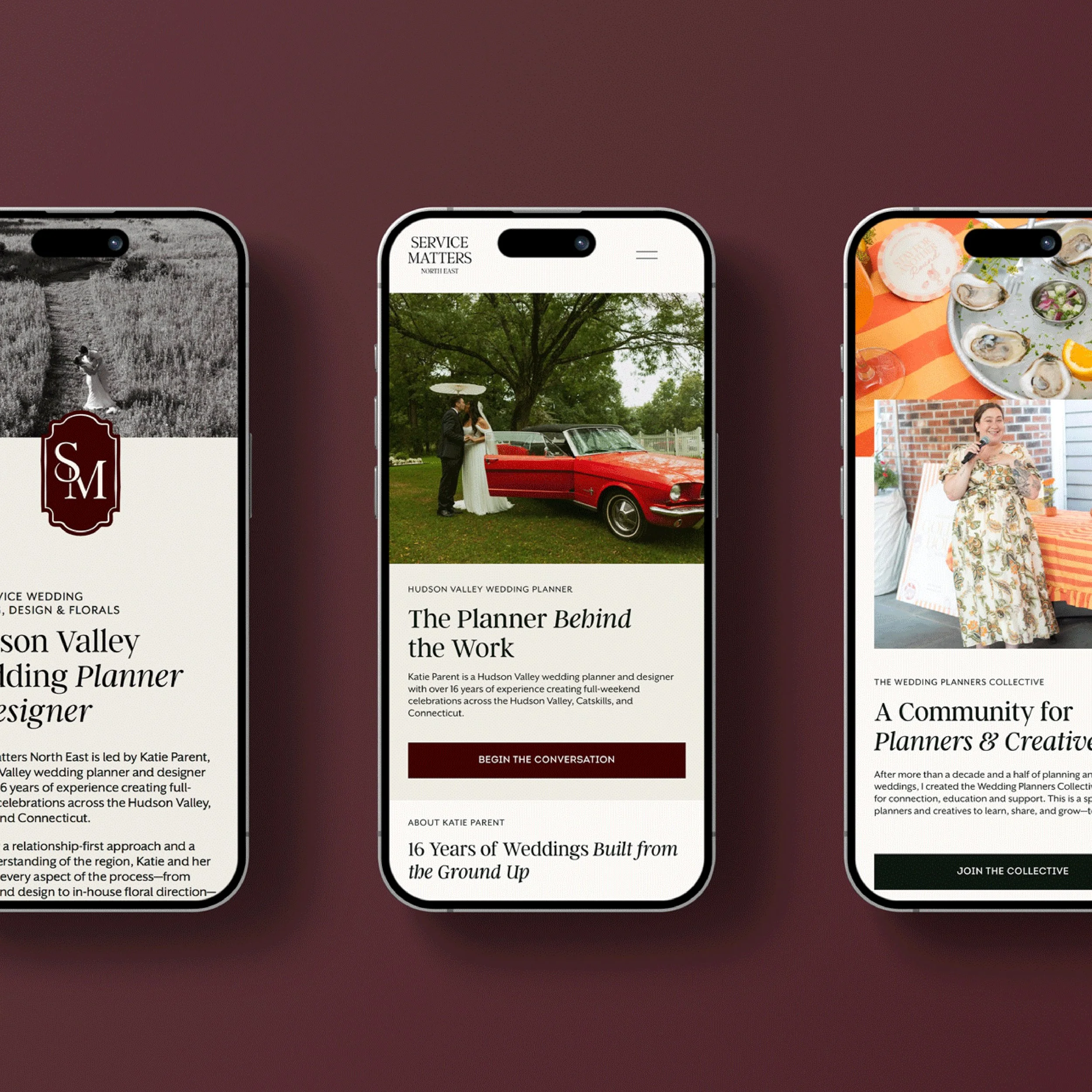
The symptom: The first screen leads with a broad slogan or a striking image, but it doesn’t clearly say what you do, who you help, or where you work.
Why it matters: Visitors shouldn’t have to piece together what your business offers. If the answer isn’t clear within a few seconds, they may leave before exploring.
Try this: Write a specific headline that names your service and audience. Use the supporting text to explain the value, and add a clear next step. For example: “Heating and cooling services for Connecticut homes” tells a visitor more than “Comfort, thoughtfully delivered.”
2. There’s no clear call to action
The symptom: Your website has several vague buttons, or the only contact link is tucked into the footer.
Why it matters: Interested visitors need to know how to move forward. If they have to decide between several competing actions, they may put it off.
Try this: Choose one primary action for each important page. Use specific language, such as “Request an estimate” or “Book an introductory call,” and place it where visitors can find it. Repeat it after key information, but don’t turn every section into a different invitation.
3. Your pages take too long to load
The symptom: Large images, embedded features, or animations make pages feel sluggish, especially on a phone.
Why it matters: A slow page adds friction before visitors have even seen your offer. It can also make the experience feel less considered.
Try this: Resize and compress images before uploading, remove features you don’t use, and check how your pages perform with Google PageSpeed Insights. Google’s Core Web Vitals guidance is another useful reference for understanding loading, responsiveness, and visual stability. Start with the pages that matter most, such as your homepage, service pages, and contact page.
4. Your site is difficult to use on mobile
The symptom: Text is hard to read, buttons are difficult to tap, a form is awkward to complete, or the page requires sideways scrolling.
Why it matters: A phone visit should feel like a complete experience, not a smaller, compromised version of your desktop site. If a visitor can’t use the navigation or find your phone number, they may give up.
Try this: Test your homepage, service pages, and forms on a real phone. Check that text is readable, menus work, phone numbers are tappable, and important content is easy to reach. Responsive web design services can help make the layout and interactions feel intentional across different screen sizes.
5. Too many things compete for attention
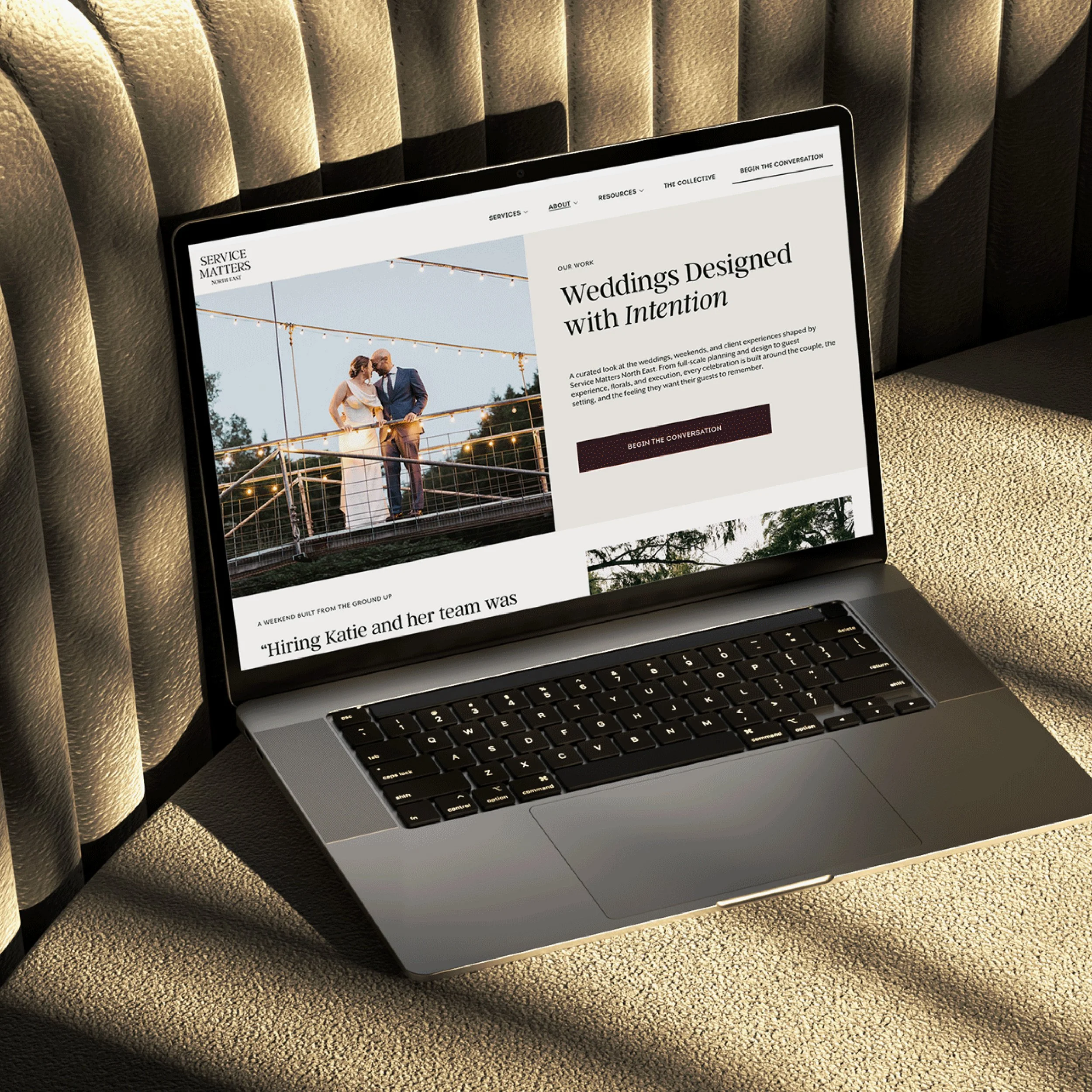
The symptom: The page is crowded with links, pop-ups, banners, buttons, and sections all asking visitors to do something.
Why it matters: A visitor who can go in ten directions may not choose any of them. Visual clutter can also bury the information they came to find.
Try this: Give each page one main job. Keep the navigation focused, remove sections that don’t support the visitor’s decision, and use clear headings and spacing to guide the eye. A simple path from service, to relevant proof, to inquiry is often easier to follow than a page that tries to say everything at once.
6. Your contact details are hard to find
The symptom: Visitors have to search for your email address or scroll to the bottom of several pages to find a contact link.
Why it matters: Someone ready to get in touch shouldn’t need to work out how. Difficulty finding your details can make a business feel less accessible than it is.
Try this: Include a clear contact link in your main navigation and footer. Make your phone number tappable on mobile, and give your contact page a straightforward heading. If you serve a specific area, make that clear too. Finally, test your contact form to confirm submissions reach an inbox you monitor.
7. Your website doesn’t show enough proof
The symptom: Your site describes your services, but there are no testimonials, reviews, examples of real work, or other signs of what it’s like to work with you.
Why it matters: A potential client is deciding whether to trust you with a need, a budget, or a project. Specific evidence can make that decision feel more comfortable.
Try this: Add honest testimonials, project examples, client reviews, or credentials that are relevant to your work. Place them near the services or inquiry points they support. Use real, approved client work and say what the project involved without implying results you can’t verify.

8. The design is making visitors unsure
The symptom: Inconsistent typography, dated visuals, blurry images, or mismatched colors make the site feel disconnected from the quality of your work.
Why it matters: People use the website to form an impression of the business behind it. If the experience feels careless, they may wonder whether the service will feel that way too.
Try this: Review your design as a whole. Use a consistent type and color system, choose clear imagery, and make sure each page feels like it belongs to the same business. Good design isn’t decoration for its own sake. It helps visitors understand where they are and what matters. If your current site no longer fits your business, custom web design services may offer more room to shape the experience around your content and customer journey.
9. Your inquiry form asks for too much
The symptom: A visitor has to answer a long list of questions, create an account, or share details that don’t seem necessary just to start a conversation.
Why it matters: Every extra field adds effort. Some visitors will decide the form isn’t worth completing, especially on a phone.
Try this: Ask only for the information you need to respond. For many service businesses, a name, email address, and short message are enough to begin. Make phone optional unless it’s essential. Use clear field labels, keep the form usable on mobile, and include a confirmation that explains what happens next.
10. There’s no clear reason to take the next step
The symptom: The site invites visitors to “get in touch,” but doesn’t explain what happens after they do or why they should contact you now.
Why it matters: A visitor might be interested and still delay if reaching out feels uncertain or like a bigger commitment than they’re ready for.
Try this: Make the next step feel straightforward. Explain what someone can expect after submitting a form, how you typically respond, or what an introductory conversation covers. If you have a real deadline or limited availability, share it plainly. Skip fake countdowns or manufactured scarcity; a clear process is more reassuring.
Start with the point of greatest friction
You don’t have to rebuild your whole website after spotting one weak area. First, check the basics: confirm that your forms work, try the site on a phone, and ask someone unfamiliar with your business what they understand from the first screen. Then focus on the obstacle that makes it hardest to inquire.
If several of these points ring true, a design refresh focused on clarity and conversion can help bring the pieces together. You can compare custom web design services and website templates, explore why responsive design matters on every screen, or get in touch with Studio Pierson to talk through what your website needs.