

Real estate is a relationship business, and people often meet your brand before they meet you. They might find you through a social post, an email introduction, a listing sheet, or a referral from a friend. When those pieces feel connected, it’s easier for potential clients to recognize you and understand what working with you might feel like.
That doesn’t mean every post needs the same layout, or that your logo should take over every page. It means the details work together: your colors, typography, photography, tone, and contact information feel like they belong to the same person.
Branded templates make that consistency easier to maintain. You get polished, ready-to-use materials without needing to start from a blank page every time or keep a designer on call for every new listing.
Why consistency matters in real estate
Your work appears across many places. A buyer might see a neighborhood guide on Instagram, click through to your website, then receive your contact details in an email. A seller might review your listing presentation before deciding whether to book a meeting.
Each interaction is a chance to make a clear impression. A consistent visual identity helps connect those moments, while thoughtful content gives people a better sense of your approach and local knowledge.
There’s a practical reason to pay attention to these channels, too. In its 2025 Technology Survey, the National Association of REALTORS® reported that 75% of respondents used social media in their real estate business. The survey also found that social media was the top lead-generating technology named by respondents. It’s one more reason to make the experience feel intentional when someone discovers you online.
Consistency isn’t about looking bigger than you are. It’s about making your work easier to recognize and your information easier to follow. A thoughtful template can help you show up professionally even on a busy week when the new listing, the inspection, and the “quick question” all happen at once.
Start with a system, not a pile of graphics
Templates work best when they’re built from a clear brand foundation. Before designing individual pieces, establish a few simple choices:
Color palette: a small set of primary and supporting colors
Typography: a headline font and an easy-to-read text font
Logo use: approved versions, placement, and clear space
Photography style: guidance for listing photos, portraits, and local imagery
Contact details: consistent name, title, brokerage, phone, email, and website
Voice: the way you introduce yourself and explain your value
The goal is not to lock every design into one formula. It’s to create enough structure that your materials feel connected, while leaving room for each property and story to have its own character.
Templates with the most day-to-day value
The right set depends on how you work. For many agents, a few flexible, well-designed templates will be more useful than a large library they never open.
Social posts and stories
Social content can help you share new listings, open houses, price changes, recent sales, client feedback, local market updates, and useful advice for buyers and sellers. A small set of layouts can cover most of these needs.
Consider templates for:
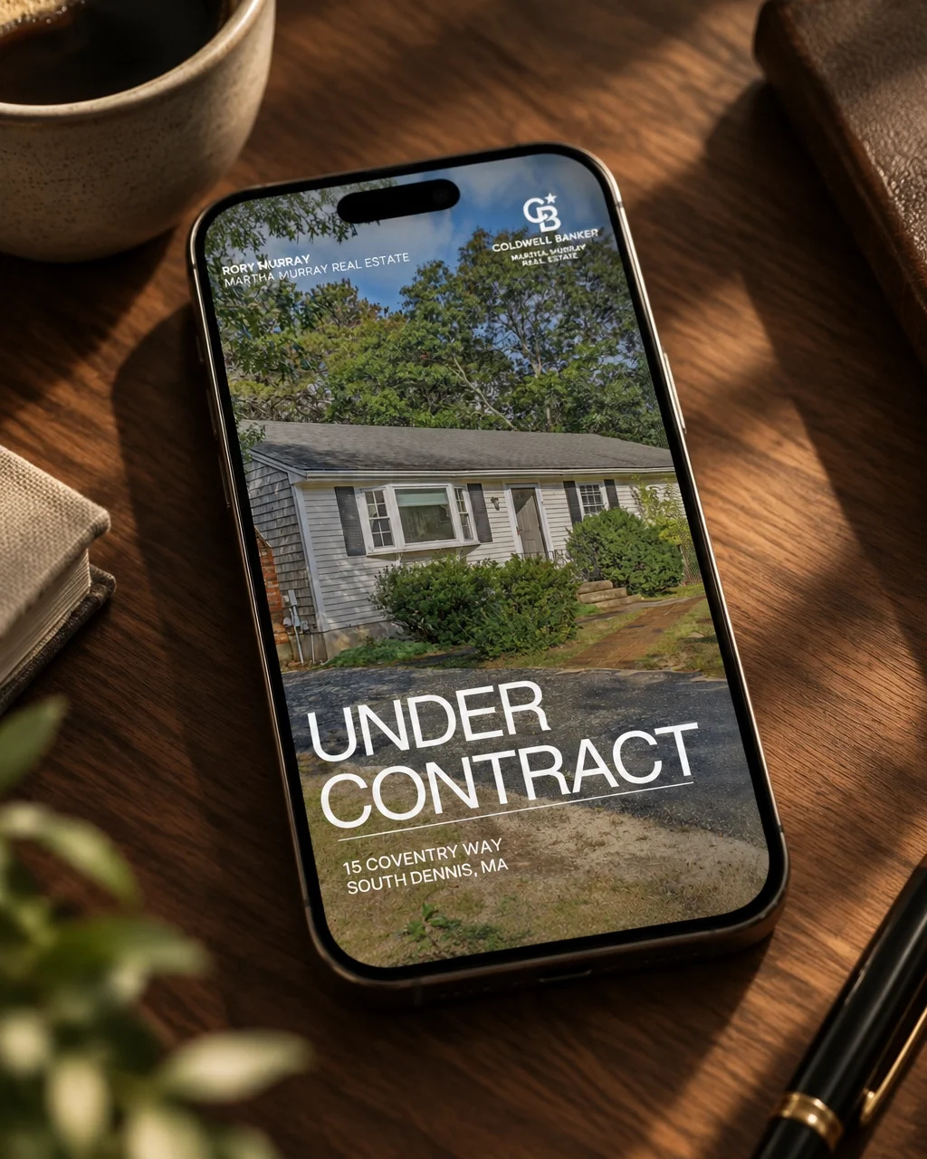
Just listed, open house, under contract, and just sold
Market updates and neighborhood guides
Buyer and seller tips
Client testimonials and frequently asked questions
Stories, vertical video covers, and calls to action
Your content should still feel varied. Keep the visual identity consistent, then let the photography, subject, and message change. Zillow’s social media guidance for real estate professionals also recommends a consistent presence across platforms, alongside content that’s relevant to your audience.
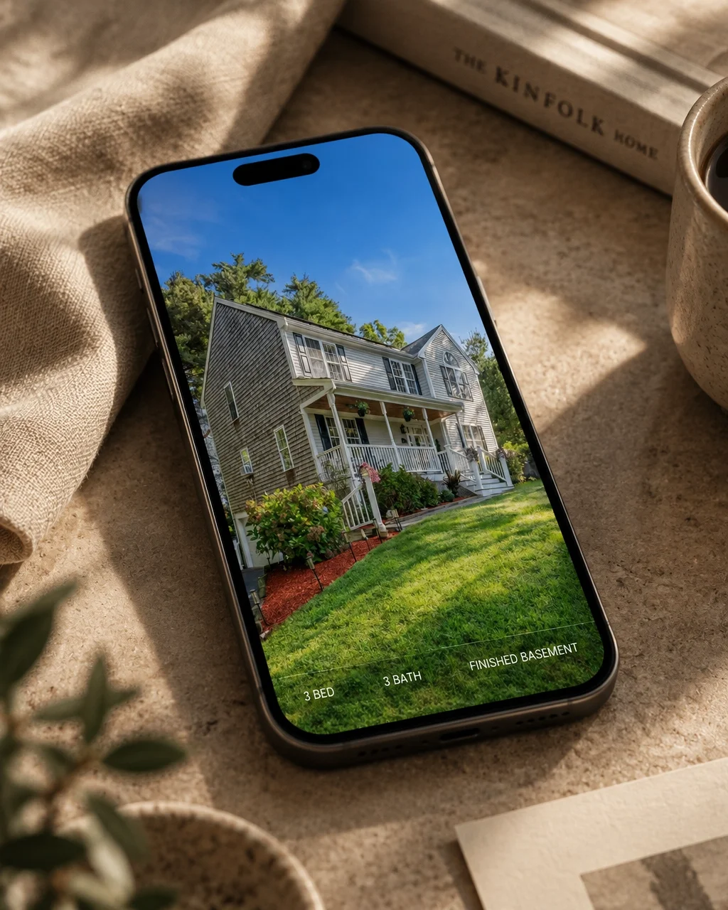
The templates shown in this post are real examples we created for one of our real estate clients. Notice how the layouts change with the message, from a new listing to an under contract announcement to a brand-forward campaign graphic, while the type, spacing, and placement stay unmistakably hers.
Listing sheets and property flyers
A property feature sheet needs to do more than look attractive. It should make key information easy to find and give the home’s photography room to work.
A reusable layout can establish a clear hierarchy for property details, your contact information, brokerage requirements, and any required disclosures. Each listing brings its own images and information, but the design framework stays familiar.
Listing presentations
A listing presentation is a chance to show how you think, communicate, and plan. A branded presentation template helps you explain your process in a clear, organized way. It might include an introduction, local market context, pricing approach, marketing plan, communication expectations, and next steps.
The design should support the conversation, not compete with it. Give the information space to breathe and tailor the details to the seller and property. A template is a starting point, not a reason to send every client the same presentation unchanged.
Email signatures and campaign graphics
An email signature is a small detail, but it appears in everyday communication. A clean signature can make your name and contact information easy to find and connect your emails to the rest of your brand.
It’s best to create a version that works as real, selectable text, rather than relying only on a single image. That can make details easier to read, copy, and use across email clients. Campaign headers and simple email graphics can carry the same visual system into newsletters and listing announcements.
Supporting pieces
Depending on your business, you may also get regular use from a buyer guide, seller guide, open-house sign, postcard, business card, or social profile graphics. Prioritize the materials you reach for most. A smaller toolkit that fits your actual workflow is more useful than a folder full of designs that don’t.
How templates save time without making your brand feel generic
A good template takes repeat decisions off your plate. You don’t have to choose a new font, adjust logo placement, or rebuild a layout whenever you need to announce an open house. You can focus on the information that changes, such as the property, the audience, or the advice you want to share.
This is the kind of work we do with agents on an ongoing basis. One of our current clients is a real estate agent, and we create her social media templates month after month, so the layouts, colors, and typography stay consistent while each post reflects what’s happening in her business that week. An ongoing relationship like that means the system keeps working as her listings, seasons, and goals change, and she never has to think about whether the brand is holding together.
That doesn’t mean every post should look identical. The system should make room for different property photography, seasonal content, and your own voice. Think of it as a well-organized framework, not a script.
The easiest templates are also practical to update. They should be labeled clearly, sized for the places you use them, and simple enough to edit without specialized design software. Before calling a template finished, test it on a phone, export a sample for print, and check that your information stays legible.
Keep brokerage details in the loop
Agents often work within brokerage, MLS, state, and local association requirements. Those rules can affect logos, disclosures, titles, and how your contact information appears. Check the current guidance that applies to your business before publishing or printing a new template.
It’s worth building those requirements into the designs from the beginning. That way, the correct brokerage information and disclosure space are part of the system, rather than something you have to squeeze in later.
A thoughtful template system starts with your brand
At Studio Pierson, we approach templates as an extension of your visual identity, not as a collection of disconnected graphics. First, we get clear on who you serve, what you want to be known for, and where your brand needs to show up. Then we create a cohesive identity and practical assets that fit the way you work.
That might include social media templates, listing materials, presentation layouts, email graphics, or a signature. The mix depends on your business. We want the final toolkit to feel like you and to be straightforward to use long after the design process is over.
You can learn more about Studio Pierson’s branding and design capabilities, browse examples in the project portfolio, or get in touch to talk through what would be most useful.
Your brand doesn’t need to show up everywhere at once. It just needs to feel considered wherever a client meets it. Start with the touchpoints you use most, build a system around them, and let consistency make the busy parts of your business a little easier.